Day of Design

Day of Design

Day of Design featuring great design, architecture, fashion, graphics and innovation from across the globe.


Lifewtr Series 7: Art through Technology

Lifewtr Series 7 Art Through Technology is a bottled water packaging series that presents the work of creators active in art and technology. The bottle labels carry artworks by three emerging artists. Technology broadens the boundaries of possibilities within art and design, and ninety two percent of art organizations agree that technology has made art a more participatory experience, which helps to diversify audiences. The series turns each bottle into a surface for new work and gives wider visibility to working creators.

Continue reading

 

Winetime Seafood

The packaging design for the Winetime Seafood series should demonstrate the freshness and reliability of the product, should differ it favorably from competitors, be harmonious and understandable. The colors used (blue, white and orange) create a contrast, emphasize important elements and reflect brand positioning. The single unique concept developed distinguishes the series from other manufacturers. The strategy of visual information made it possible to identify the product variety of the series, and the usage of illustrations instead of photos made the packaging more interesting.

Continue reading


Source One Vodka

Source One Vodka is a bottle and packaging design for a single-estate vodka distilled from locally grown oats and water from Sierra snowmelt. The glass structure is formed from offset panels inspired by greenhouse architecture, creating the illusion of an endless spiral when the bottle is turned. The width of each panel was calculated to suit the bottle circumference and to stay parallel to the two-part mold. The labels are printed on cotton paper with debossing, embossing and foil stamping. The closure is made of birch wood and natural cork.

Continue reading


San Liang Jiang

San Liang Jiang is packaging for a liquor inspired by the culture of Sanxingdui, an ancient site in Chinese history. The ceramic bottle takes its form from a bronze human face, and the upper part of the bottle can be used as a cup. Spray paint and gold stamping are applied to the surface, and black is the main colour. The bottle is wrapped in a clay-like material and placed inside a convex tin box measuring 250 by 175 by 100 millimetres. Small shovels, brushes and hammers are included, so the bottle is uncovered like an excavated relic.

Continue reading


Bionyalux

The concept of restoring skin in new skincare products coincides with the zero burden of bagasse recycling, environmental protection, and ecological concept. From the product features of the 60-day food-grade limited shelf life of the 30-day skin improvement treatment process, 30 and 60 are selected as the visual recognition symbol of the product, and the three stages of use, 1,2,3 are integrated into the vision.

Continue reading


Yan

The design of the bottle was inspired by nature and the principles of bio mimicry specifically the form of a bitten apple. This was meant in order to show the organic quality of the product inside. This anatomy results in complementary shapes which when placed next to one another on shelves or during transportation allow to maximise the saving of space. The name of the brand is inscribed on the label with a stylised calligraphy. This calligraphy evokes the colour and appearance of thin grass as a nod to Nature.

Continue reading


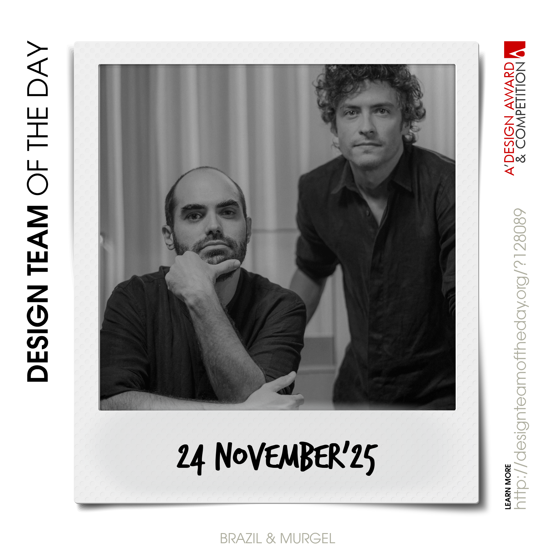
World's greatest design teams.

Sometimes you need a very big team of talented designers to come up with truly great designs. Everyday, we feature a distinct award-winning innovative and creative design team. Explore and discover original and creative architecture, good design, fashion, graphics design and design strategy projects from design teams worldwide. Get inspired by the original works by grand master designers.

Continue reading
